
Play Pentajump
Pentajump's itch.io pageResults
| Criteria | Rank | Score* | Raw Score |
| Theme | #15 | 3.962 | 3.962 |
| Gameplay / Fun / Engagement | #33 | 2.923 | 2.923 |
| Audio / Sound Design | #35 | 2.808 | 2.808 |
| Overall | #36 | 3.077 | 3.077 |
| Art Style / Visuals | #47 | 2.615 | 2.615 |
Ranked from 26 ratings. Score is adjusted from raw score by the median number of ratings per game in the jam.
Game Engine / Tools
Godot
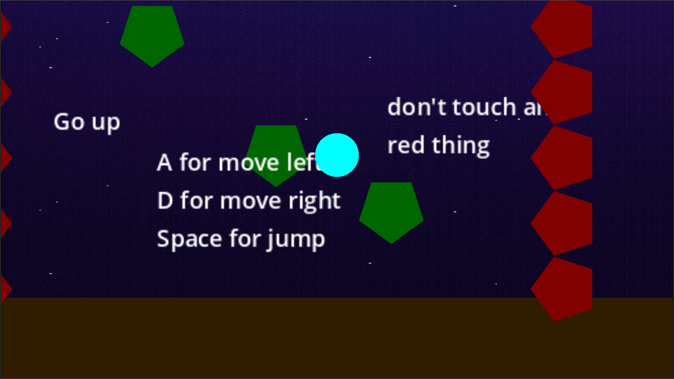
How does your game fit the theme?
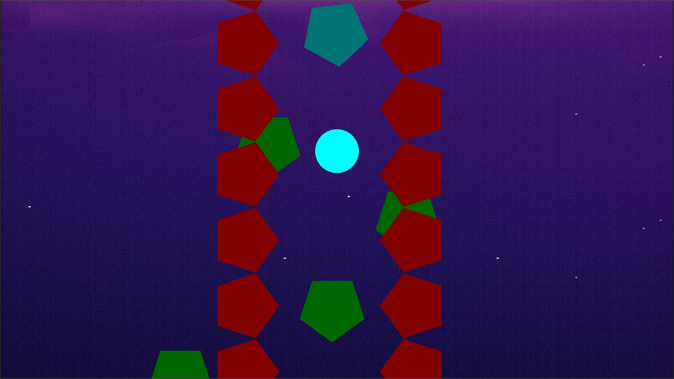
The space gets smaller with time.
Leave a comment
Log in with itch.io to leave a comment.
Comments
Perfect, it was perfect! Down to the last minute detail. Love the piano in the background. Short and sweet puzzle, I liked it a lot. Finished it in about 5 minutes. I liked that each level presented a new feature and that you built on previous features on the next levels. Great submission Byte!
Thanks for your comment, you can follow me to know when I add a new levels
I add stars for Audio / Sound Design have setting take stars away for Theme for having forbidden shapes in the UI
Hey byte, nice entry! I liked the difficulty progression and the core idea is very nice aswell. The game is easy to understand and pretty straight forward.
A couple of things where I'd see room for improvement is in some minor things. I'd recommend you to implement a "coyote jump" - that would allow the player to jump even if they're technically not grounded anymore. That makes plattforming usually feel a lot smoother and less frustrating.
The player can't jump if they're small and between two pentagons (probably because there is no floor directly underneath them?), that feels a bit clunky at times, especially when there is time pressure on the level.
When it comes to colors I can't recommend enough getting into color theory a bit. There are loads of tutorials on youtube and it does make a huge difference.
Good job on your finished game!
thank
Great job with the theme for this game! I really felt the pressure seeing all the red pentagons closing in. As other folks commented, the visuals and audio could use some work, but the game design and difficulty curve was very strong. Keep it up!
Thanks
short but sweet puzzle platformer, i really enjoyed it! we have a very similar mechanic in our game of switching between big and small to solve the platforming, i think you used it well here, the levels were fun!
some minor feedback:
overall i enjoyed it and i think you did a great job!! well done!
Thanks for your comment, I am already working on modifying these things and will add new things
Personally, I'm not usually a fan of puzzle games because I tend to find them too difficult — but yours was totally understandable, and I really enjoyed it!
I found it very creative how you used the available elements to create different challenges with such limited resources. Each level feels completely unique due to how the elements are rearranged. Pulling that off is no easy task, and I think you did it very well.
The atmosphere is really pleasant, and the music fits the vibe of the game nicely — which I believe was meant to be something more peaceful and casual. That said, I did feel the lack of some sound effects for frequent gameplay elements, like the player’s death, jumping, or an audio cue for when the goal is reached. It’s not something that breaks the experience, of course, but it could really enhance the immersion and overall player satisfaction.
The theme was well applied — even literally — using pressure as the core concept that drives the game’s sense of adrenaline. That worked really well for your idea, so I’d say you definitely nailed that aspect.
This next point might be more of a personal thing, but I found the menus to be overly large for the amount of options they contain. It doesn’t really get in the way, but it gives a sense of emptiness and a lack of visual appeal, making the interface feel a bit lifeless — even if that wasn’t the intention. Another important point: it looks like you used squares and a line in the settings menu, which could be seen as breaking the jam’s shape limitations rule.
The only thing that slightly hurt my experience was the precision of the jump and the overall player control. Sometimes it felt like the character would slide too much, and at other times it felt a bit stiff. As for the jumping mechanic, maybe consider adjusting the jump height based on how long the button is held — that might be more player-friendly for certain puzzles, like the red pentagons near the final levels.
Overall, I’d say the game has a lot of potential. With a few extra additions, this concept could easily become something more polished and complete, especially with more levels that make the most of the creativity you've already shown. One last suggestion: try exploring some color palettes that better match the mood you're aiming for, as the current one feels slightly out of harmony.
Congrats on the game, and best of luck in the jam!
Thank you for playing my game and writing a comment. Sorry for the banned things. I did not notice that I put them and I will fix these things and the player’s movement.
This game needs polish, but hell, I HAD FUN!
First of all- the controls could be smoother. The first couple times I died it was because the jump felt weird. But after I got used to the fact I needed to jump first, and steer later, as well as really fast movement speed I started to feel this game.
The colors felt dark, and a bit drab. You can use this tool, to generate interesting color palettes: https://mycolor.space/
The theme? The incoming walls were constantly limiting the playspace, and that affected the gameplay in an interesting way, which is what I think this jam is about!
In the end, the game is ok. With slightly better movement, better graphics, maybe some sound effects, it could be great.
Keep it up, you'll get there :)
thanks
Nice submission for the jam and shows a solid idea, but it needs more polish in execution. The theme fits perfectly, but visuals, controls, and audio feel rough and hold the experience back. Here my honest feedback:
Game play / Fun / Engagement ●●●○○
There aren’t many controls, but moving and jumping doesn’t feel smooth. It’s often hard to reach height, because of missing a platform and sometimes it feels like the character gets stuck (although size was changed). This makes the platforming frustrating at times. That said, the core idea is good and has potential, so game play gets a solid 3 out of 5.
Art Style / Visuals ●●○○○
I appreciate that you tried to stick to the given shapes, but the UI unfortunately contains non-allowed shapes, which breaks the jam’s rules. On top of that, the colors don’t match very well, and the overall design feels more like a prototype. Because of this, I give visuals 2 out of 5.
Audio / Sound Design ●●○○○
The audio is not very special and restarts every time you hit the wall, which quickly becomes annoying and frustrating. There is no special SFX and compared to other entries, this category feels much weaker. That’s why I rated it 2 out of 5.
Theme ●●●●●
The theme is the strongest part of the game. The “limited space” concept fits perfectly and directly drives the game play. This category deserves a full 5 out of 5.
Thanks
nice game !!
I really injoyed the game , the changing size and the fake platforms mechanics are very well introduced and Suitable for game overall concept .. the game itself fit the jam theme
I think you should work a little bit on the visuals .. and the fps counter should stack one the screen you can achive that easly by adding it as child of canvas layer node
thanks for your comment
bruh
bruh indeed, thanks for checking out the game
Nice little puzzle/ platformer, I could complete all levels! The rules and reduce size ability are explained quite well in a progressive manner, and the build up in difficulty is also quite smooth.. the last level was definitely the hardest! I also liked the fake platform concept, did not feel unfair at anypoint.
One suggestion i would have is to some animations or effects on landing of the ball on platforms to make it smooth and things like when the level is complete or the red things hit the ball etc.. that kind of feedback would enhance the gameplay a lot in my opinion. Also the speed of movement could be reduced a bit. I got used to it as i played more, but initially it was a bit difficult to handle Overall Nicely done!
Thanks a lot for playing and for the kind words! I’m glad the progression and the fake platforms felt fair and enjoyable. Great suggestion about adding animations and effects I agree that would make the gameplay feel smoother and more polished, so I’ll definitely look into that. I’ll also experiment with reducing the movement speed a bit to make it easier at the start. Really appreciate your feedback
Simple and fits the theme and constraints well. Borderline troll level on some.
thanks for playing my game
Simple and fits the theme and constraints well. Borderline troll level on some.
Cool mechanic of changing the size to fit into limited spaces. The controls were a bit too difficult for me to use though, and the movement and the changes are not smooth enough for my taste. But this is not the kind of games I enjoy or am good at, so don’t take it personally. The use of allowed shapes in the game itself is without fault, but the UI elements (buttons, etc.) are off.
Thank you so much for the detailed feedback! I’m glad you liked the core mechanic. I totally get your point about the controls and UI, I’ll keep that in mind for improvements. Really appreciate you taking the time to play and share your thoughts
I understand the controls might feel tricky on keyboard. Just to let you know, the game fully supports PlayStation, Xbox, and Joy-Con controllers, which might give you a smoother experience.
I like the idea !
You can improve the movement of the player by add a longest curve of speed progression. It will increase precision on those tiny little pentagon platforms. Maybe you can be interested by this tutorial https://kidscancode.org/godot_recipes/4.x/2d/platform_character/index.html
Thanks to use physical key, I am on an azerty keyboard !
The idea of panel moving for the menu is interesting (Maybe you can move them a little bit faster). Also, maybe you can be interested by this project I participated to develop https://github.com/rakugoteam/Rakugo-Game-Template . It handle GUI scaling when you have tiny or big resolution.
I'm so glad you like the idea! Thanks so much for the detailed suggestions and links, they're very helpful. I'll definitely check out the movement guide and the rakugo game model, they look really interesting for improving controls and expanding the UI. I also like the menu panels, and I'll try out faster movement in them too. Thanks for sharing your thoughts.
Visually, the game has some strange resolutions. For instance the main menu and UI text is super vague and pixelated compared to the actual player and obstacles / platforms. Perhaps you can adjust some settings on your images in Godot (I have only ever used Unity). The gameplay is really smooth tho, and the levels are quite creative! For the specific level with the 'fake platforms', with the walls closing in fast this particular level is more trial-and-error and hope for the best, which is a bit out of touch for the platformer concept it has.
The UI for the fps should also not be parented to your game-object as it currently flies above the screen if your player jumps. While playing I loved the music because I was thinking that you recorded yourself playing the piano, but you credited the sounds from some other place. The concept fits the theme quite well, and great use of the limited shapes.
Finally, your game icon on itch is probably the most appealing of the bunch! great job on that, really grabs the itch.io scroller to play your game.
I’m happy you enjoyed the smooth gameplay, level ideas, and the music, and I really appreciate you pointing out the resolution and UI issues I’ll look into the image settings in Godot to make them sharper. Good catch about the FPS counter moving with the player too, that definitely needs fixing. As for the ‘fake platforms’ level, I see what you mean I’ll try to balance it so it feels less like trial-and-error. And I’m really glad you liked the game icon on itch, that made my day! Thanks again for taking the time to share your thoughts.
Visuals and audio meh. I however do love the idea with the walls closing in to climb up and the pentagons used as pointy thorns / rocks sticking out to crush you, even though I didn't think it was much ''fun'' I do believe the idea deserves a decent rating. I think if it looked better and had better music I would be more inclined playing this. Could give Rayman vibes.
I'd also add some glowing orbs that you could collect on the platforms and some odd placed extra hard platforms where you can earn extra points with.So you have the challenge of deciding whether you'd want to continue the easy route or try the hard route but possibly lose.
Sidenote: I'm from a French speaking country, we use azerty keyboards. Which make the buttons not match what to press. Might be handy to also allow the arrow keys as a quick fix, since mouse isn't used.Thanks so much for the thoughtful suggestions! I’m glad the core mechanic resonated that’s exactly what I was aiming for. You’re right about the visuals and audio needing polish; I’ll work on sharper UI assets and a better music loop (aiming for a more ‘warm’ vibe). I’ll also add arrow-key support quickly for AZERTY users and plan to introduce optional glowing orbs and bonus hard-platform paths for risk/reward. Good note about balancing the ‘closing walls’ level I’ll reduce the RNG feel and add clearer telegraphs/checkpoints
By the way, the game fully supports Xbox, PlayStation, and Joy-Con controllers for a smoother experience. Also, I have to admit I’m really bad at sounds and graphics still learning and trying to improve there. Really appreciate the feedback
At first i thought the music was really cute, until i started playing and it got really stressful lol. the sides closing in made my anxiety go up, but fits the theme really well! i liked the size changing idea, only in the second level when i got stuck between 2 pentagons i could do nothing but wait for the red to kill me. i understand it might be hard to make a small gap between pentagons, so maybe you can try to improve this outside of the jams limits. gg!
The FPS UI should be parented to the camera not the player so that it doesnt move relative to the camera and also add some acceleration to the player's movement so that it is easier to make small precise adjusment movements and generally just make the platforming feel more natural also atleast give a hint on which platforms are fake like a slight color change would be enough to not make it feel unfair. also the UI utilizes rectangles.
Thanks for your advice I didn't see all of this I will fix all of this later
My first thought is... gosh the menus are so slow! It's really frustrating, and in the real world I'd have immediately moved on to a different game 🫠 especially considering that the pace of the gameplay is much better once you actually start! One other major thing to note is that this game is completely unplayable for anyone with red-green colourblindness, which is the most common type. I also really don't like the "some platforms are fake" mechanic, generally in games you want the rules to appear consistent otherwise the player will get mad.
It's not all bad, though! I love the speed of the character, and the change size mechanic is interesting if a little underutilised. You've implemented the theme well, and stuck to the spirit of the "limited shapes" theme which I love to see.
Thanks for your comment and I will try to fix all of this in the new updates.