
On Sale: GamesAssetsToolsTabletopComics
Indie game storeFree gamesFun gamesHorror games
Game developmentAssetsComics
SalesBundles
Jobs
TagsGame Engines

Lou Bagel

206
Posts
14
Topics
108
Followers
43
Following
A member registered Sep 22, 2017 · View creator page →

Creator of

Recent community posts

Thanks for trying it and leaving feedback!

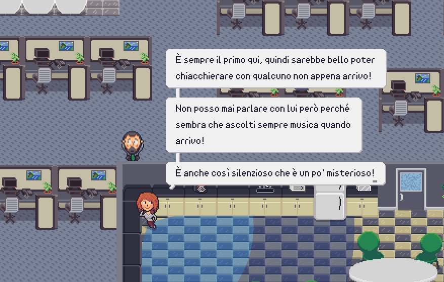
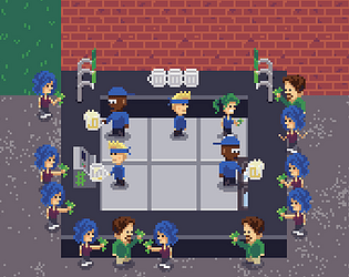
For the chance/random, were you thinking of the room that has three characters walking? That one was random - not in the mathematical sense but in the game design of it, as each of their routes were independent of each other and had different durations. I'll take the feedback as to be more intentional with the design.

The last room, I was intending to have different ways to solve it. As I worked on it I thought maybe it could be an "easy" way of using all the distractions (there are 3 in there) and a "hard" way of not using any and just do timing. I think the "hard" way ended up being too easy. I might play around with that room more and also be more intentional with routes kind of "syncing" there as well.

Thanks again, this really helped!

Thanks! What was your favorite or least favorite part?

Also, FYI, I have finished the last room now!

Oh man, I used to be a ninja rope pro in Worms, but gonna have to do some training for this one!

Very nice!

Did anyone else in advanced mode just keep trying things randomly instead of planning things out? haha

Sweet, thanks! Let me know what you think!

I see the title screen now! (which I didn't before)

👀

Player character is holding a sword but can't swing it. If not going to have an attack in the game should use a sprite without a sword and such to give expectations to player. For one reason, so they aren't trying to figure out what the attack button is, but also for general expectations.

Hey, a couple things I thought of for feedback while playing:

  • The main player sprite blends a bit with the background; would be good to update colors to player stands out more
  • The items, whether power-ups or obstacles etc, on the platforms are a pretty small and not obvious what they are or do. They could probably be made a bit more intuitive.

No bugs or anything and works well, so good job overall

It won't proceed past this initial screen for me. Is there something I'm missing?


Sorry for the delay - thanks for the breakdown! I'll check you your game soon!

I'm glad its relatable lol - thanks!

That's good feedback! There are different animations for the coffee maker but I think its just too small and I didn't realize until later that Chatty Cathy starts blocking it. Thanks! (and sorry for the delay)

Thank you!

Thanks! I love that you refer to MGS when talking about this! Its some of what I was going for and love the series as well so such a honor!

I was actually thinking while watching your play through that I feel like the range of her vision should be reduced. I believe her cone is currently a 45 range of vision but I might try out something like 30 and see how that feels.

Thanks for those tips! I was planning on giving it another go later so they will help!

Pretty cool game!

Only played one time part way through. It is pretty rough not being able to change the order of units once you place them, but can see how that makes it a big part of the strategy once you know what kind of units will be available.

At certain times it seems a bit unclear on what to click on or what you can click on. Took a bit to realize that you could upgrade units. Also, never really understood the freeze and the interactions when clicking on the units to buy.

Thank you! I appreciate that!

Cool concept! 

Couple of feedback:

  • I was lazy and didn't read the instructions at first since they looked long. Went back and read them after a couple games and they were good - but you might be able to make things a bit more intuitive in-game
    • Even just putting the word "Power-ups" or something over the bar of available special items
    • Having tooltips or a text bubble when selecting a power-up would be good even if it is a short description
  • It seems like the power-ups came in pretty fast. It could be a bit more strategic if you get less of them, but with more it is kind of more fun ha

I'm not sure I understood the mechanics. Is it completely random?

Would love for it to be a bit more "zoomed out" so you can see more at once, especially the ground beneath you while you are jumping

I've reviewed the following games: 

  • GemSeeker: Path of Rust
  • Purple's Escape
  • Waste Wise

Also, couldn't figure out how to get started with Crazy Highway and left a comment about that.

If it wasn't obvious, I was making a lil joke with that comment - game has been out a while - but thanks for that note. I haven't looked at if the demo works or what not in years.

Thanks for the feedback! 

I will most likely leave it in. I think it makes the art look a bit more odd walking diagonal but player experience is more important.

Thanks! I took your advice and made this just for you last night: https://store.steampowered.com/app/1103790/DaveMan/ 

A few thoughts:

  • I'm not sure if I am supposed to be finding things or simply running to the right
  • The steam doesn't look like something that would kill you
  • At least the restarts are very quick and don't set you back!
  • I actually enjoyed dying because of the animation, ha

Hey, I was unsure what to do - as in how to get started. Seems stuck on title screen.

Hey i recorded my playthrough for your visual feedback: 


I'd definitely say it is a bit slow, with my biggest complaint being not aware of where the door will appear. Sometimes this causes you to basically beat the level twice - the first time to see where the door will appear and then restart and re-plan it out knowing where you need to end.

This isn't horrible, but the fact that the guy moves fairly slow and you can't skip the dialogue makes the game seem like a crawl.

Overall it seems polished and such, but it just needs less downtime for player.

One huge thing that would help is some kind of feedback when item falls into bin successfully. 

I noticed there is an effect when it goes into the wrong bin, but there should be one for the correct bin as well to let the player know they are doing something correct.

Especially since it doesn't actually look like they are going into the bins, with the z-index going behind the bins. That would be next item I'd say to fix.

Hey I recorded my play-through for visual feedback: 

(note I wasn't trying to comment on everything like a streamer, but had mic on to react to some things)


Thanks!

FYI, there is level 2: https://loubagel.itch.io/survive-the-day

But it is from years ago. This is basically a re-make of level 1, where level 2 hasn't been re-made yet. Still, if you want to experience a "new level" you can check that out. Different type of gameplay.

Yeah, this has def been a big request. Thanks for the feedback!

Thanks!

I think that has to do with the way I changed storing all the settings and then adding new ones - so that just reminded me I didn't test that out much. I'm curious if you load the game another time, if that still happens (since it should update to the new settings).

Hey Everyone!

Loved this jam the last time I did it! I got some great feedback, so I wanted to make sure I got some of that feedback implemented before I submitted this time!

See the recent updates here of the features I'd love any feedback on: https://loubagel.itch.io/daves-coffee/devlog/895342/beta-features


KingKelpo gave the idea for the text bubbles fading out, the field of vision turning (instead of being set to, or "jumping" to), and also basically the sliding when bumping into objects.

But several players gave really similar feedback!

Blawnode mentioned the zoom level getting stuck when pausing or looking at a poster. Believe that is fixed. As well as the Chatty Cathy animation bug (fingers crossed! lol).

Other people asked for 8 direction movement - not sure if they were part of this jam or not, but was definitely a big request.

Looking forward to round two (for me) of the No Pressure Jam!!!!

I decided to give the 8-direction movement a try! 

By try, I mean, it still only has 4 directions of animations even though you can move all 8 directions. So I'm seeing if people like it or think it looks odd that way.

Thanks for the feedback!

Hey thanks! I can't believe I didn't think to look at the spacing data myself - I guess I thought "can't touch that or I will mess everything up" ha.  I will give that a try - or just wait to see if any players give feedback first - thanks again!

Yes, my game supports several languages. They are all computer translated though, so I'm not sure the quality. If you want to try, either from the Title Menu or Press P to pause, and go to Settings > Dialogue > Language. 

If you do, be sure to let me know how it goes! I'm still working on getting the cutscene text, ui, and menu translated. Also, there is a language learning mode to try out!

(1 edit)

I really like how clean and readable this one is as well, with such the small font size.

Initially thought the Gs (lowercase) were getting cut off, like from the edge of my text box size/ref area, but they are that way.  Then I noticed, are they backwards?

Also, do you think there is a extra space in the letters that make it harder to read? I find myself losing the spaces between the words sometimes, since the spaces don't seem that much larger, but I'll leave it to you as the font expert.


Note that I tested out reducing letter spacing ("character spacing") in C3, but that reduces the size of the spaces as well. There is no word spacing in the engine. Not shown in any of the pics above, but I can upload one if desired.

I still think it is very readable overall, but I feel like the spacing forces me to read it slower. Still 5 stars! :) 

You might have been the first one! Not sure though...

I will be shocked if anyone beats that!